
Brand story
Everything meets at the X.
AITeCXO sits where two disciplines usually stay apart: the judgment of a technology executive and the hands of an engineer who builds. The identity is built on that crossing. The X in CXO isn’t just a letter in the name. It is the brand, and every other element comes from it.

The idea
Three strokes, one position
Each part of the symbol stands for one half of the work, and the place where they meet.
Leadership
The solid bar
One heavy stroke, top-left to bottom-right. It stands for executive judgment: accountability, priorities, and the decision about what is worth building at all.
AI and systems
The node line
A fine connector between two nodes, read as a network edge or a data path. It stands for models, pipelines, and the systems that do the work.
The point of value
The ember diamond
Where the two cross. This is the moment strategy becomes a working system: the player-coach position the practice is built on, and the outcome clients pay for.
The name
AI · Tech · CXO, without the dots
Casing is the reading guide
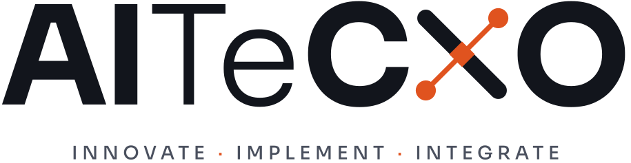
The name keeps its own casing: AITeCXO. Weight does the separating: AI in bold, Te in light, CXO in bold. You read “AI · Tech · CXO” without dots or spaces breaking up the name.
The X is drawn, not typed
The X in CXO is the brand symbol, sized to the exact cap height of the type. That one substitution ties the text logo to the mark, so either can stand alone and still feel like the same brand.
The tagline names the work
Innovate · Implement · Integrate are the three service pillars on this site, in order. The three I’s echo the AI at the front of the name, and the ember dots link the line back to the diamond.
Color
Why ember, not blue
Most AI and cloud brands use blue, so a blue logo blends into the category. Ember is warm, confident, and easy to remember next to ink.
It works because it is rare. Ember marks one point, the place where strategy becomes a working system, so we keep it to a small share of any page.
Ink #12151C
Type, the mark’s tile, dark backgrounds. A blue-black reads richer than pure black and sits softer on screen.
Ember #E0531F
The diamond, the nodes, the tagline dots. Used sparingly, about 5–10% of any layout, so it always marks the point of value.
Mist Ground #F2F3F5
Light background. A cool off-white that keeps pages from glaring.
Slate #4A505E
Secondary text on light backgrounds. 7.3:1 on Mist Ground.
Mist #A9AEBA
Secondary text on Ink. 8.2:1, readable for body copy.
Typography
Sora, on purpose
Sora is a geometric sans with open shapes and even stroke widths. It stays crisp on screens, pairs with the clean geometry of the X, and avoids the overused defaults that make technology brands look interchangeable. It is free under the Open Font License, so anyone on a team can install it.
Light 300 ·Regular 400 ·SemiBold 600 ·Bold 700
The mark
Built to survive 16 pixels
The X sits in a rounded ink tile so it keeps a fixed, recognisable shape as an app icon, favicon, or avatar. The 22% corner radius is soft enough to feel modern and firm enough to stay a square at 16 px. Below about 32 px the diamond turns to mush, so the browser-tab version drops it and thickens both strokes.


The full guide
Using the AITeCXO identity?
The guidelines cover lockups, clear space, minimum sizes, accessibility contrast, and the file to use for every placement.
Download the brand guidelines (PDF, 400 KB)Ready to put AI to work?
Book a free 30-minute discovery call and we’ll map the highest-value opportunities for your team.
Book a free discovery call